In building wine.study, we quickly got to the point where we were experiencing a development bottleneck in the construction of components. This bottleneck occurred due to a number of reasons. We solved it with a live style guide.

Some of this slow down was because we were conflating the thinking about the application flow with the individual components. But even more than that was just in testing for regressions as we changed style rules and how we were handling data. Being early on in development there was a lot of churn and refactoring as we were getting things nailed down.
The solution we came up with was to have a living style guide that would host our components with fixture data. This quickly changed how we even approached building components.
What is a style guide
There are a lot of different ways people use the term "style guide". At Eldarion this typically has mean a static url in the project that developers can reference to see the markup and class names that our designers and front-end developers have used to build different aspects of our UI. This in turn makes it easier and faster for developers to build out UI using the bits in the style guide as building blocks.
Until wine.study we had only followed this approach on regular Django projects that used server rendered Django templates.
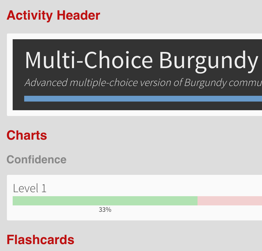
In the context of a React project, a style guide is an endpoint that hosts your components in one or more variations of data (e.g. short versus extra long text for a title) to test and validate how your components work under different conditions. Furthermore, it's interactive so you can easily test the internal state changes of your components (e.g. in the case of an educational site like wine.study, flipping a flash card, selecting an answer).
Why you want one
We created a style guide to solve one particular problem: cutting down on the development bottleneck of building out new components. It really sped up the time it took us to build out additional complex components and component hierarchies.
But if you put one into place, you'll also:
- Be able to quickly check for regressions
- See how your component handles all the different variations in data
- Build components before you have real data available
- Collaborate with product managers and designers earlier and easier
- Make it easier for front-end developers who are more design focused to contribute
How we built out the wine.study style guide
For wine.study, we basically added a new route and top level component that would host all the components we were building out:
import StyleGuide from '../style-guide';<Route path="style-guide" component={StyleGuide} />The StyleGuide module was a fairly static container component with exception of a fly out menu that linked to anchors for each component as the page quickly got pretty long. We chose a fly out menu so as to maximize screen real-estate to focus on showing components.
We then created a data/ folder inside the top level style-guide/ folder to hold all the fixture data that we'd load into the components.
There was a minimal amount of style that we added for the StyleGuide component to help isolate the style guide bits from the site-wide style. Basically, the following:
.style-guide-wrapper {
    padding: 15px;
    background: #DDD;
    > h1 {
        font-family: Helvetica;
        font-size: 1.5em;
        border-bottom: 1px solid #DDD;
    }
    .style-guide {
        > h2,
        > h3,
        > h4 {
            font-family: Helvetica;
            color: #C00C00;
        }
        > h2 {
            font-size: 1.4em;
        }
        > h3 {
            font-size: 1.2em;
            color: $gray;
        }
        > h4 {
            font-size: 1em;
            color: $gray;
        }
        .component-container {
            background: rgb(250, 250, 250);
            border: 1px solid #DDD;
            border-radius: 3px;
            margin-bottom: 20px;
            padding: 10px;
        }
    }
}
Then we imported a component, some data, and added it to the render method of the StyleGuide component:
import ActivityTiles from '../components/activity-tiles';
import { activities } from './data/activities';
<div className="style-guide-wrapper">
<h1>wine.study Style Guide</h1>
<div className="style-guide">
<a name="activity-list"></a>
<h2>Activity List</h2>
<div className="component-container">
<div className="homepage">
<ActivityTiles activities={activities} />
</div>
</div>
</div>
</div>This gave us something like:
Process for building new components using the style guide
Pretty soon a process surfaced for how to build new components.
- Add a new module for the component with a skeleton amount of code in order to use the component.
- Add a new SASS module for the component and import it in the site's main SASS file. We scope each component's style with the class name we give each component's container element.
- If this component depends on a set of data more complex than just setting some properties, go ahead and create a file in
style-guide/datawith the data needed and exported from the module. We have found that most of our components can reuse some bit of data that is already there after awhile. - Import the new component and any data needed into the
style-guide/index.jsmodule. - Add a new block in the
render()method that includes and anchor, then a header, then a<div className="component-container">wrapping your new component. - Now you can open your browser to
/style-guideand start developing your component, adding functionality, markup, and style.
For item 6, we use a combination of watchers and BrowserSync so we just have to save to watch the page reload itself to see our changes.
In Summary
We can't recommend living style guides enough. They are very useful when building server rendered templates in something like Django. They are absolutely indispensable when building React components. Hopefully, this post is enough to get you started and on your way to making your React development even faster.
It should be noted that React Storybook is worth checking out. There is a lot of overlap, if not an outright replacement for our homegrown style guide.